Con-Crēt® Creatine
Icon System Mini Case Study
The Challenge
Supplements are a crowded, confusing category- packed with claims, science jargon, and hard-to-read labels. Con‑Cret needed a fresh visual language to help customers understand benefits quickly and navigate choices, especially online.
The Solution
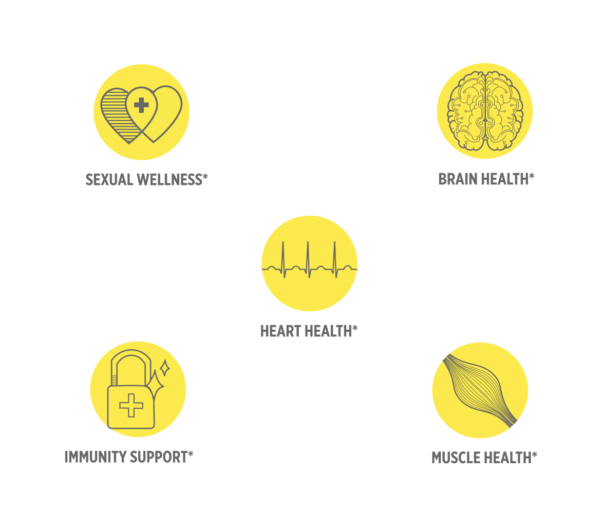
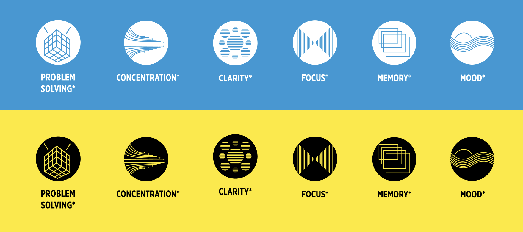
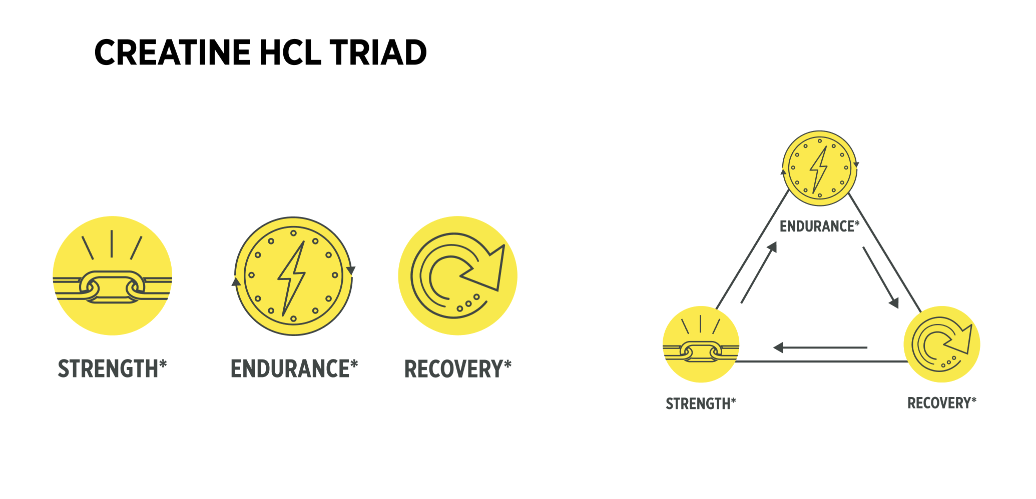
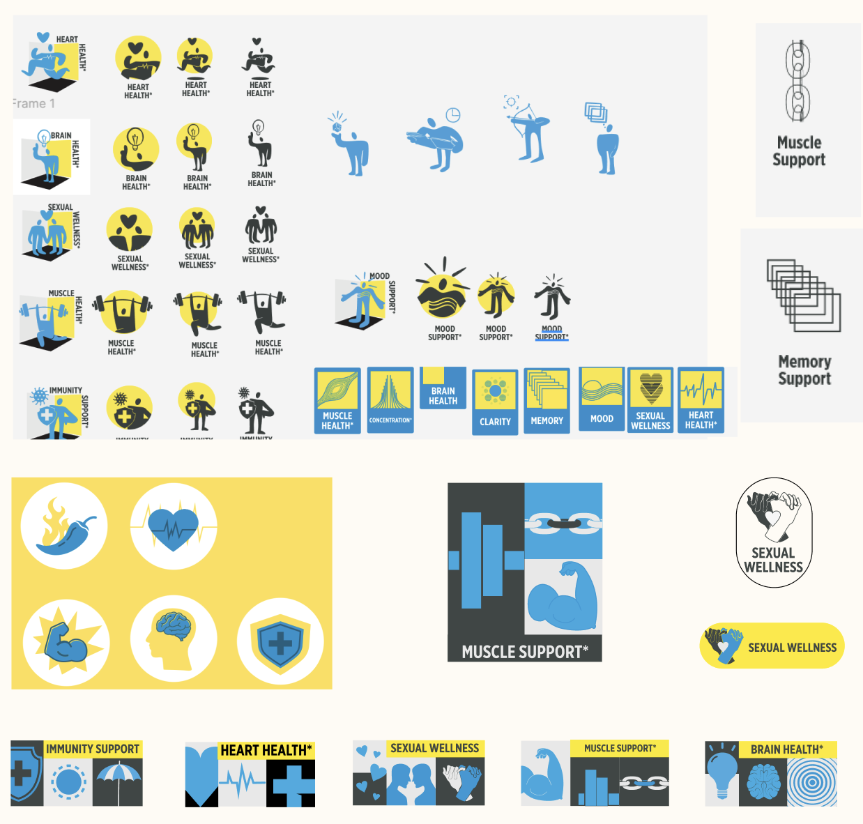
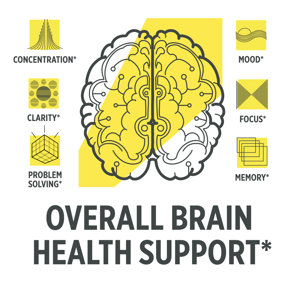
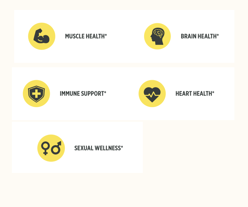
I created a modular icon world anchored to Con‑Cret’s bold, science-forward brand. Each icon wasdesigned to communicate complex product details (e.g., “Micro Dosing,” “Endurance,” “Strength,”“No Fillers”) with immediate clarity at a glance. The system is scalable, allowing each product SKUand content channel (Amazon, DTC, packaging, infographics, influencer slides) to pick the right“visual vocabulary” in a consistent, on-brand way.
My Approach & Things we Tried
Working in collaboration with regulatory and brand teams, I began with exploratory sketchesmapped to core product claims and consumer FAQs. Icons evolved from molecule motifs and performance arrows into a family of ownable designs—each tested for legibility on packaging, mobile thumbnails, and banners. I built out usage guidelines, ensuring the icons worked in monochrome, color, and even overlay applications. I tried and tested several iterations before landing on my final set.
The Outcome
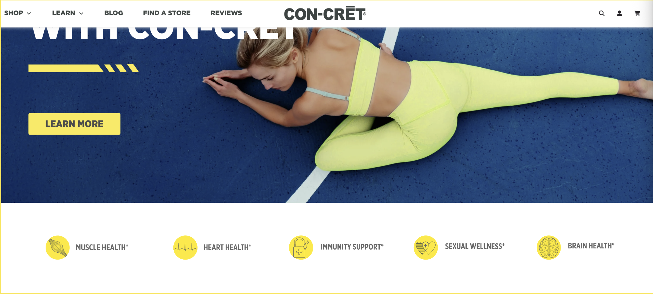
The new icon system became a cornerstone for the brand, appearing everywhere from PDPs toretail shipping boxes. Icons act as quick cues and “micro-stories”—reducing cognitive load andgiving customers confidence to add to cart or pick the right formula in-store. The visual system hassupported new product launches and made even complex claims (like “Bio-Available”)approachable and easy to spot.
Before

After