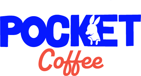
Pocket Coffee – Case Study
The Challenge
Build a coffee brand from the ground up with a fully realized concept, visual identity, and experience design. Pocket Coffee started as a creative exercise I used with my direct reports: here's a random theme, now build a brand around it. My version evolved into something bigger, a proof of concept showing my range from strategic thinking to illustration to copy and brand experience.

The Concept
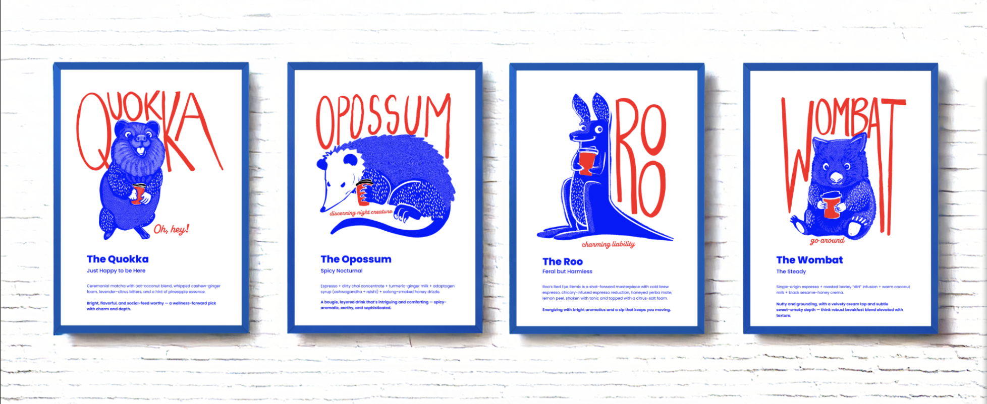
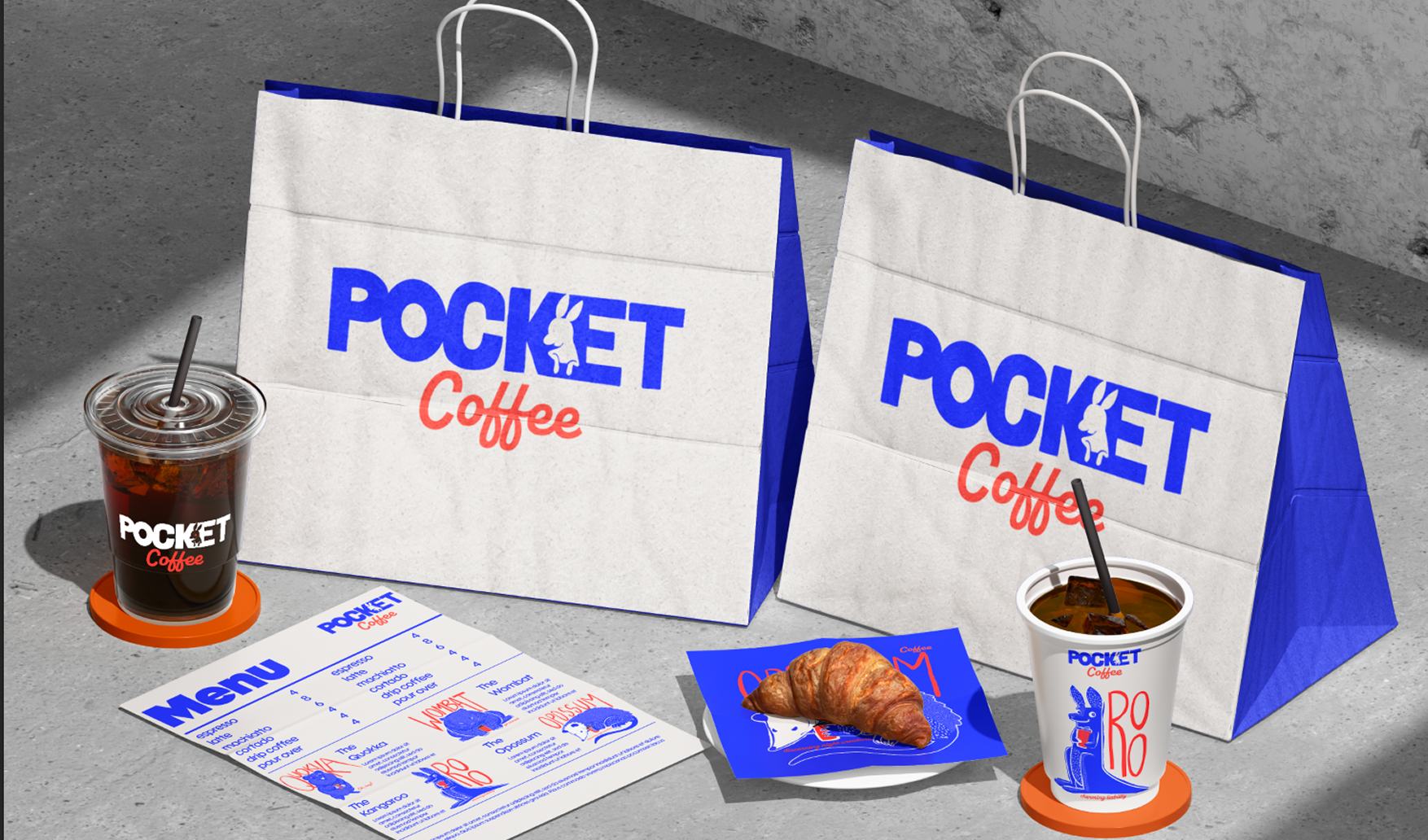
Pocket Coffee sits in the white space between soulless chains and beloved-but-struggling indie shops. The brand is built around four marsupial mascots, each one matched to a signature specialty drink and a very specific kind of person you definitely know.
The Possum is a dirty chai, the discerning night creature who knew it was good before you did and isn't up before noon, ever. The Roo is a high-energy red eye: loveable chaos in a cup. The Quokka is a matcha, pure Ted Lasso energy in fur form. The Wombat is an earthy, mushroom-forward latte, steady, grounded, hard to knock over.
These drinks are the hook: Instagrammable, ingredient-forward, personality-driven. They're what gets tourists lining up at the window. But solid drip for $4 is there for the local who just needs their morning sorted. Both customers matter, and the model is built around both.
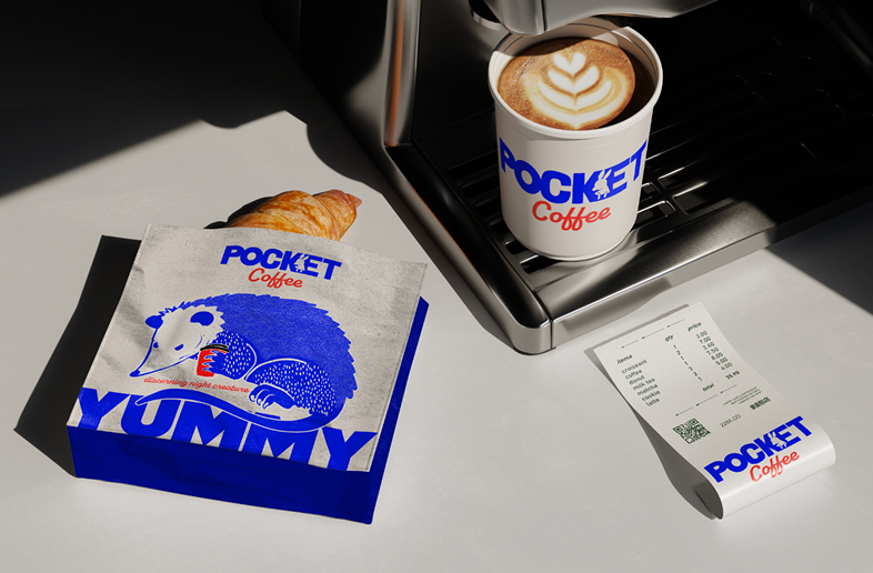
Design & Experience
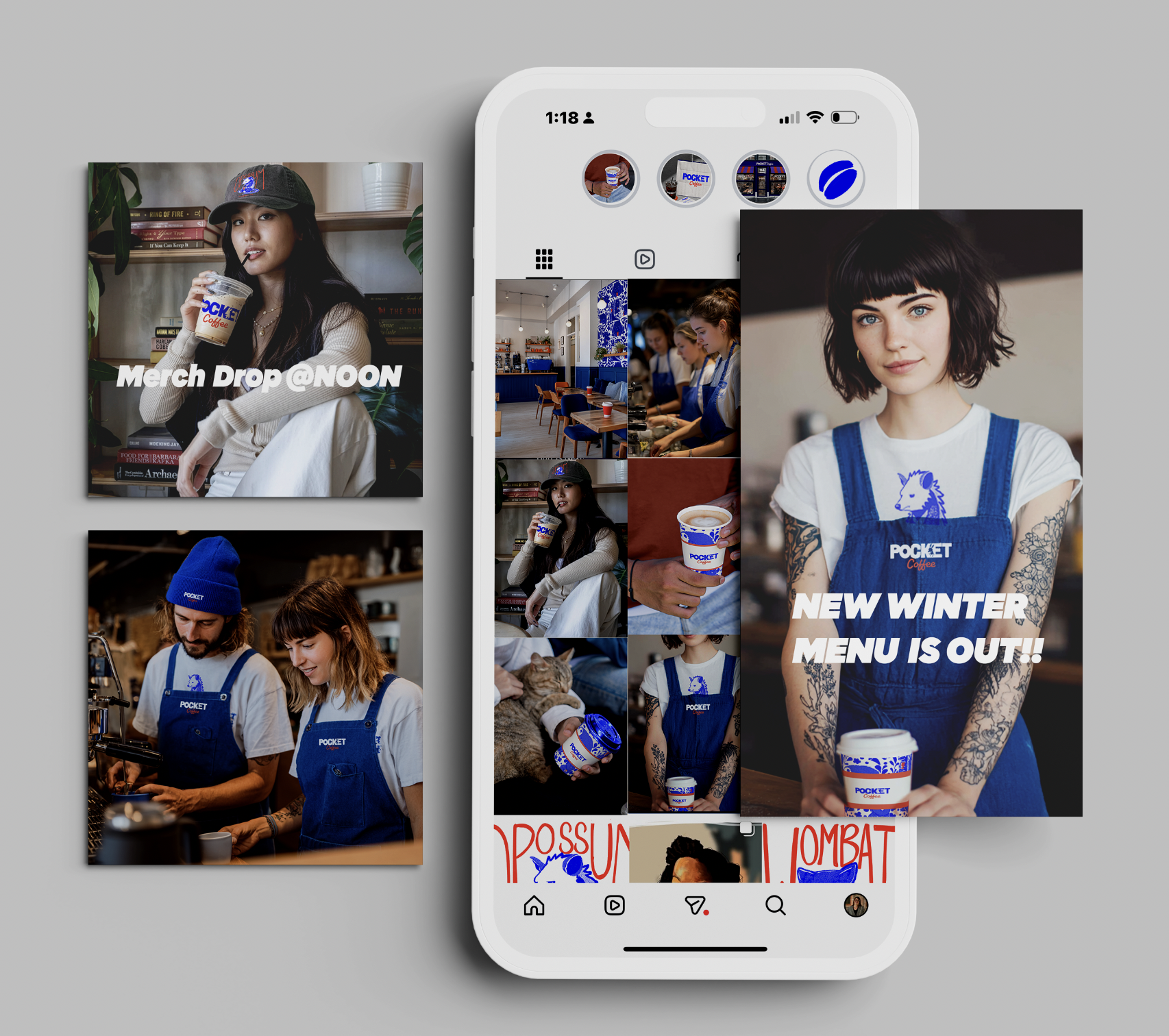
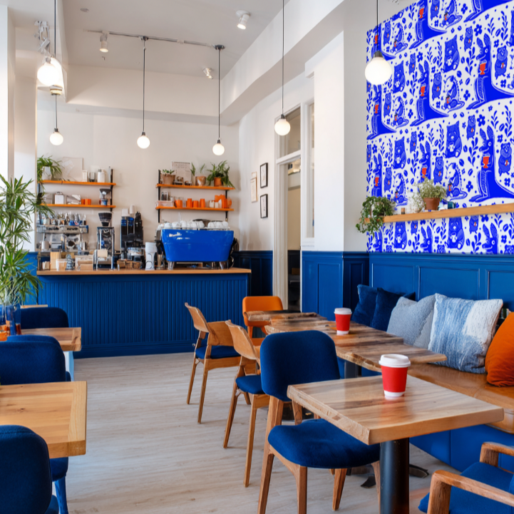
The visual identity is warm, playful, and illustration-driven, with each mascot bringing distinct personality to menus, signage, and merch. The store layout reflects the same thinking: a main dining room (The Pocket), a walk-up window for quick service (The Side Pocket), a patio with phone pockets built into the tables (Out of Pocket), and a work zone for the laptop crowd (Back Pocket). Chairs painted by local artists, community event space, and a "We see you" greeting at the counter make every detail intentional.
Merch extends the brand beyond the physical space. Character tees ("Discerning Night Creature," "Hard to Knock Over," "Oh Hey!") let customers wear their drink order as a personality statement, which is exactly the point.
Takeaway
Pocket Coffee demonstrates concept-to-execution thinking across brand strategy, illustration, copy, and experience design. It's a fictional brand, but it's built to open tomorrow, and that's the whole idea.