New A+ content and thumbnails
-
Created the new A+ Content for each SKU to support the Brand Refresh.
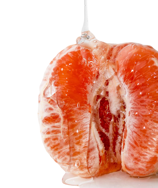
Art Direction on the photography
Oversaw Strategy and Copy to ensure it aligned with brand voice, digital SEO requirements and passed regulatory.
UX/Graphic Design
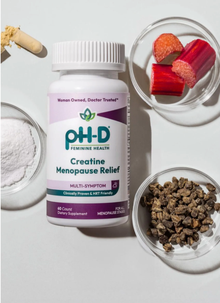
PDP Thumbnails
-
As pH-D Feminine Health prepared for major line expansion, I led the visual refresh of PDP thumbnails across channels to align with a more elevated brand voice. Working within tight budget constraints, I re-art directed existing assets—strategically compositing, retouching, and repurposing photography to achieve a cohesive, premium look without reshooting packaging. The result was a cleaner, more confident digital shelf presence that reflected the brand’s evolution. This project underscored a core strength of my work: delivering high-end outcomes through smart creative decisions, not inflated budgets.
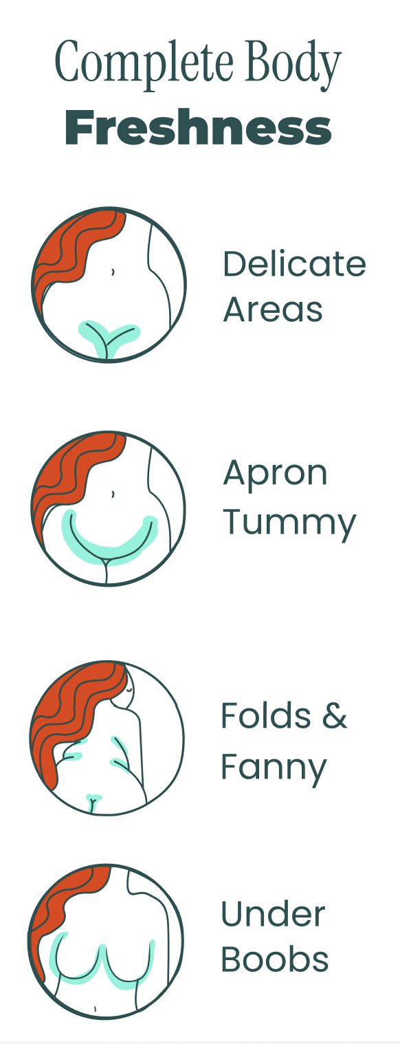
New Icon world
-
To support pH-D’s growing education platform, I developed a proprietary icon system designed specifically for women’s vaginal, reproductive, and overall health—an area where off-the-shelf icons consistently fall short. The goal was to make education feel intentional and on-brand, not clinical or generic. Inspired by the brand refresh and the founder’s red hair, I infused the new signature orange into the iconography, building on the illustrative warmth established in the Raise Your Vagina IQ campaign. The system was extended into white and teal variants for flexibility across packaging, digital education, and campaign touchpoints, creating a cohesive, recognizable visual language across channels.